We live in an era where smart phones and tablets are an integral part of our lives.
Now there are more people browsing the internet on mobile to those using a desktop computer.
There will be 2 billion of smart phone users by 2015, according to this study by eMarketer. And more than 80% of internet users will be from mobile.
If you haven’t done it yet, then you need to make your website mobile-friendly today.
You don’t want to lose potential readers (or customers)!
In this post I’ll give you specific options and tips to create an awesome experience for mobile users visiting your business website or blog.
Table of Contents
Is Mobile Really Rising?
The trend is clear, but I still wanted to check analytics data for one of my sites.
For example, Tokyoezine (my Japanese travel niche website) gets more than 64% of traffic from search engines.
I’ve set the time period from beginning of November 2014 until today.
In my Google Analytics dashboard, under the “Audience” menu, I selected “Mobile—>Overview”.
This is the screenshot (click to enlarge) :
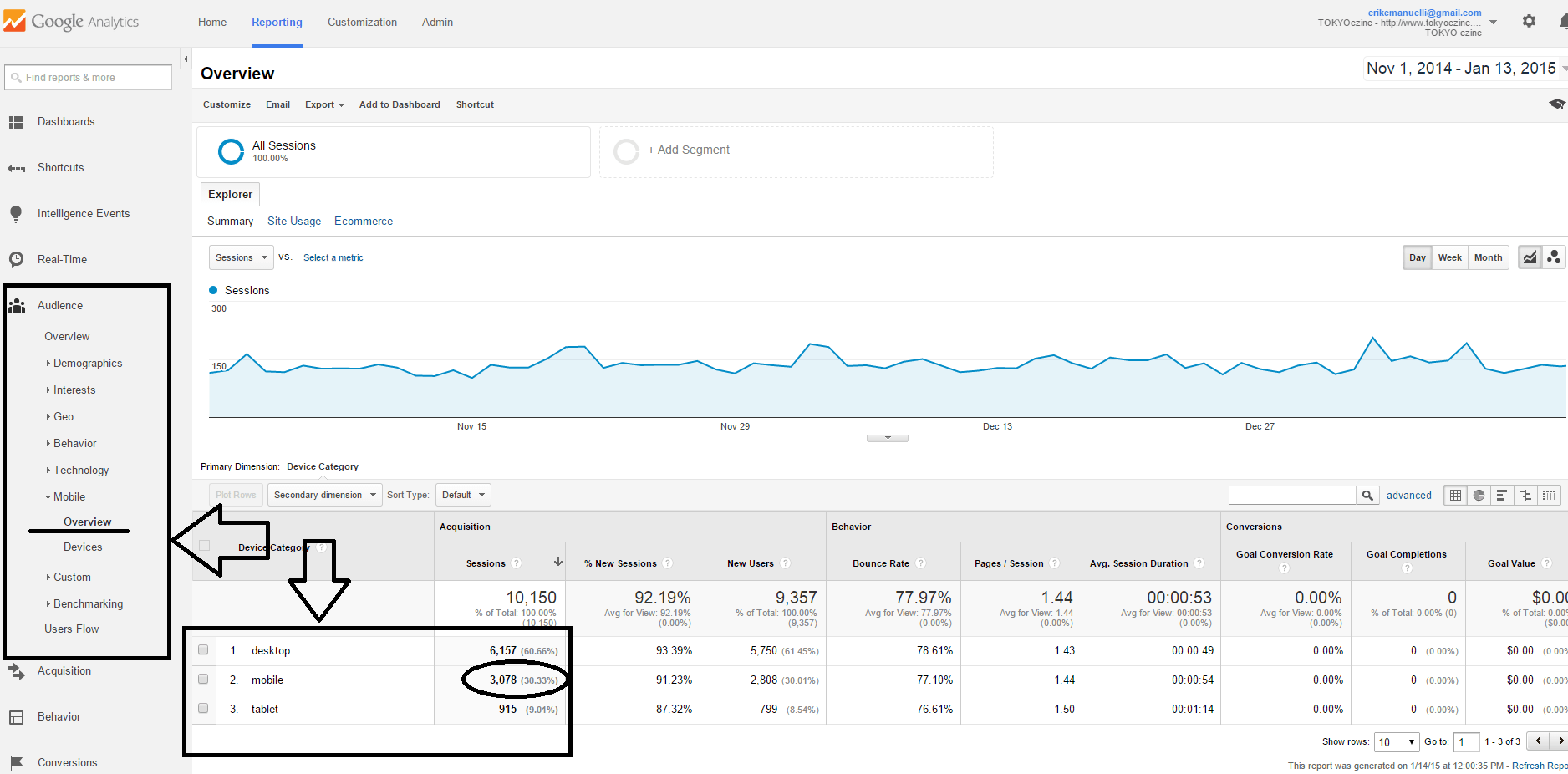
More than 30% of users are browsing my niche site from mobile.
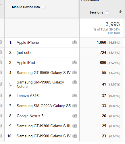
Under “Devices” tab, I found out that more than 26% of mobile visitors are from Apple iPhone, while 17% from iPad.
The rest are from Samsung or other mobile gadgets.
But I’m sure in future more visitors will land to my website from mobile devices.
And you, are you using a mobile optimized theme on your blog?
If you discover that more than 30% of your visitors come from mobile devices, can you ignore them?
Definitely not.
You want to put yourself in the shoes of your audience and think about how to create an awesome user experience from mobile.
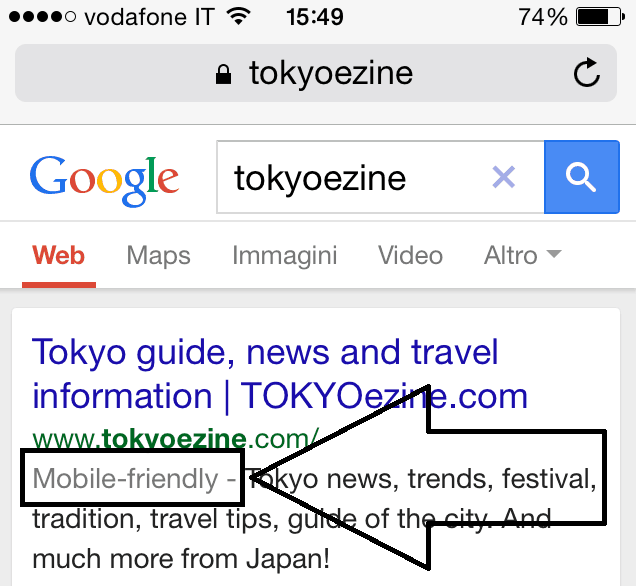
Is Your Website Mobile-Friendly?
The first step you can take is searching for your website with Google. It’s now showing if the URL is mobile-friendly or not.
This is the screenshot of my research using my iPhone:
Google gives you also a free service to check if your blog is ready to give mobile users a positive experience.
Use their mobile-friendly test to rate your blog.
The result of the test with my niche site was positive.
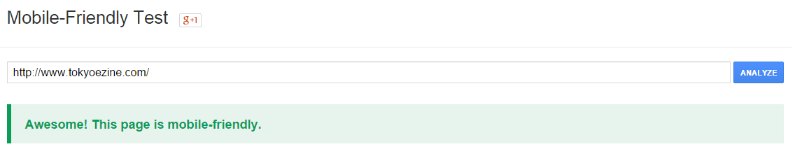
This service will also tells you how Googlebot sees the page tested.
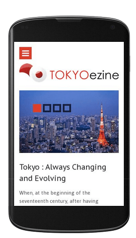
This is how TOKYOezine homepage looks from a visit on smart phone:
If the result of the test with your website was positive, then congratulations!
But if you still need to improve your blog to make it mobile, then you should read the following suggestions.
How to Make Your Blog Mobile-Friendly
There are different options available, most of all if you use WordPress.
1. Use a Mobile-Responsive Theme
If you have purchased a professional theme for your blog lately, it’s likely you have already a mobile responsive theme.
For NoPassiveIncome, I use a personalized Genesis Framework child theme (Magazine PRO).
For TOKYOezine, the niche site I use as example in this post, runs on Spectrum, from WooThemes.
Both are mobile responsive templates, with HTML5 markup.
Aside from having a beautiful design, they are both easily customizable.
I prefer Genesis, but Spectrum from WooThemes was updated in July of last year and now it looks really professional for an online magazine, like TOKYOezine.
If you want to take blogging seriously, then I suggest you to invest some money purchasing a professional theme.
2. Use a WordPress Plugin
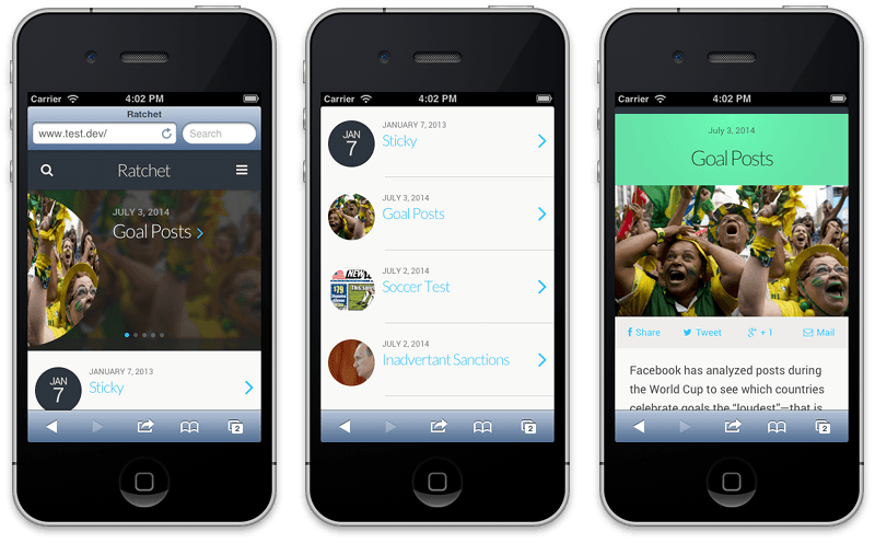
If you don’t want to invest money in a responsive template, then you can use WP-Touch, a WordPress plugin that lets you build a mobile version of your blog.
There are different plugins available, but this one has been the most popular and used for this purpose (it has been downloaded more than 6,5 million times).
Once installed, WP-Touch will create a nice mobile optimized theme for your blog.
You won’t have two different websites, but the mobile version will be shown to users landing from smart phones or tablets.
The free version gives you just one default theme, so you don’t have to tweak a lot of things in the settings. Just set up the mobile menu and add the bookmark icons.
And if you want more templates to choose from, you can get the PRO version.
Aside from WP-Touch, some other options available are “WP Mobile Detector” WordPress plugin or “MobilePress”.
Also Jetpack is a plugin that will give your website some features to make it mobile-friendly.
3. Build an Application
Generally building an application would be very expensive.
But there are some affordable solutions online.
Chupamobile offers you interesting features to create a fantastic App for your website. They have more than 1500 templates available among a large range of categories available (included business).
They also help with the process of creation and launch of the App in the Apple AppStore, Google Play and the Amazon Appstore, without knowing about coding or design.
It’s a good solution for medium-large blogs or websites.
Conclusion
Whether you choose to use a mobile responsive theme, install a plugin or build an application, you must be sure to create an awesome experience for your users landing from mobile.
If you haven’t done it until today, then I strongly suggest you to take action, as soon as possible.
As your mobile audience will definitely keep increasing in the future.
Do you have already a mobile optimized website?
What system are you using?
Please let me have your comment below, thanks!
Wait! Before You Go, Read:
 How Sponsored Posts Can Ruin Your Blog Completely
 Exploring Virtual Sports on Mostbet in Pakistan: New Betting Opportunities
 How to Successfully Borrow from Family and Friends to Buy a House (Including the Dos and Don’ts)
 How to Create Landing Pages that Make Money
 Investments That Will Make You Money In 2025
 XOVI: All-In-One Marketing Suite (Alternative to SEMRush)
 How to Produce Great Video Content without Spending a Fortune
 How To Pay Off Bills: 6 Highly Actionable Tips
 6 New Social Media You Need to Watch
 Tiny Ranker: Keep Track Of Your Site Rankings And Onpage Seo Efforts
 5 Best SEO Tools for Bloggers – They Will Help You Get More Traffic For Your Blog
 How to Get Paid by Daily Walking (With a Smartphone App)
 How to Make Money With Propeller Ads
 8 Smart Tips To Get Your Website Off The Ground
 7 Actionable Ways to reduce Your Blog Bounce Rate
 10 Link Building Tactics to Generate Free Traffic from Google
 What A Startup Need To Look For When Getting Funding And What To Avoid
 Best Elementor Addons to Decorate Your WordPress Website in 2023
 An Introduction To Affiliate Marketing
 Advice That New Bloggers Shouldn’t Ignore
 How to Use #Triberr – Best #Social Network for #Bloggers?
 Tips to Spruce Up Any Business on a Limited Budget
 The Key Elements for Ensuring Optimum Conversion for Your Landing Pages
 3 Digital Marketing Tips for Professionals Selling their Services
 How to Stalk A-List Bloggers Until They Publish Your Guest Post
Hi Erik Sir,
Superb post as usual.
Today the number of smartphone users are increasing rapidly. So we need to make sure our website or blog is mobile responsive.
I am using jetpack for responsiveness. Actually I installed it without knowing that feature.
I heard about WP-touch elsewhere. But not going to give it a try as it is costly.
Which is better Sir, jetpack or wp-touch?
Sir I want to know whether google displays our mobile’s responsiveness in searches made by mobile only? Anyway I never knew about that feature.
Thank you so much sir.
Hope you have an awesome.
Regards,
Rahul
Hi Erik,
This post got my attention. I never though to find out if my blog was mobile friendly or not. Me using my cell everyday to check it made me think it was.
I thank you for adding the link because now I know it is. I was a little nervous. 😀
Thanks!
Hey Erik,
Great post. I remember when I first started online, I was so determined to only use free themes. That’s all I did. There was no chance of me using a paid theme at all. So I started blogging for 4 – 6 months and then one day I just happened to look up my site from my phone and let me tell you …. HORRIBLE. Absolutely horrible.
The theme wasn’t mobile friendly at all and the whole thing was ugly. From that point on, I decided to just bite the bullet and purchase a paid theme. And ever since I did, I love it. But I love the fact that it’s so clean on a mobile device as well.
SO I really agree with this post. You need a mobile friendly blog because many people are starting to no longer view stuff on their desktops and laptops. It all about smart phones and tablets now and if you’re blog isn’t compatible, you’ll definitely miss out.
– Andrew
Hi Erik,
This is one topic every blogger needs to know. If our blogs are not mobile friendly, we are loosing readership. I cannot tell you how many of my readers are reading my stuff from their mobile devices.
Yes, I had my blog mobile ready early last year! I had to because I was getting feedback from some of my readers that my social share buttons were covering the content…. So immediately I changed it to being mobile friendly.
Great point!
-Donna
Hi Erik
You made just check if my site is mobile friendly. What a great post. In today’s world where smart phones have become part of our lives, it necessary for bloggers to make sure that there website is mobile friendly.
I can relate to blogs that are horrible on the mobile device, they drive readers quickly. Thank you for listing the tools that will help to achieve a mobile friendly site and thanks for sharing. Have a wonderful week.
Hi Erik,
Wonderful post!
Mobile-friendliness is already and will be a major SEO signal at search engines. Moreover, as you said, more than 30% of the users visit our site on smartphones. Making a theme responsive is not that easy and also not that difficult (if we have sound knowledge of HTML & CSS). A ready-made WP plugin can do it even for a newbie. You have touched every kind of web user in this article.
Thank you so much for sharing. Loved reading it 🙂
Have a great day!
Thanks for the tip Erik, I would like to tell you that jetpack WordPress plugin has also the option to make a WordPress blog mobile friendly, I use this plugin to perform many of the tasks and I just love it.
Hey Erik,
Glad you brought this up because I was having issues recently with my mobile plugin not working correctly. It ended up being issues with my caching plugin. Some of the settings magically disappeared and of course I didn’t set it up so I didn’t know how to fix it.
You sharing this test with us here on your post reminded me to check it again and sure enough, it wasn’t set up right. I went in search for the answer and resolved it all because of your post so thank you so much for that.
I don’t ever search sites on my phone, I’m always at home on the computer and when I’m not I’m definitely not searching online. So I’m the last person to help others with this but I know it’s a necessity to have our sites being user friendly for those searching while on their phones.
Thank you for this post and reminding me to fix this issue.
Hope you’re enjoying your week.
~Adrienne
hi Erik,
great job……..!!
Every bloggers needs to know about this….!!
Thanks for share it with us…….!!
Hello Erik,
You just solved the biggest problem that I am facing right now. Day by day mobile users are increasing for which we the bloggers should come up with responsive site. I don’t want to change my current theme. So, in this case WPtouch is the way of hope for me.
Thanks for the great help. Have nice day.
Hi there Erik,
Another site of yours (2 days back I commented on another one and today I found this blog through a different blogging community :))
Anyways, another of your superb article that I couldn’t help commenting on. It needs least mention that I have bookmarked both these blogs. And I have also read other stuff already. This is a treasure trove for me with invaluable tips that are indeed free of cost.
Thanks for posting such useful info!!!
Does a blog that is mobile friendly or has responsive design rank better in search engines for mobile traffic ? Please share your view on this.
Thanks for your suggestion.
Thank you very much Eric, for this detailed article. After, months of blogging I realized that blog should be mobile friendly because more than half of my readers are from the mobile devices. Your article helped me to make my blog mobile friendly. Thanks again. 🙂
Hey Erik,
Great tips indeed!
I just tested my site and found it to be MOBILE FRIENDLY! 😀
I am going to implement your tip of building an app but I am not into technical part so I need a developer for it. Do you know any Android Developer?
Thanks!
Great post Erik, thanks for sharing these informations. Keep posting.
Hi Erik,
Really informative article!
And this article seems more complete than my article. 🙂
Thank you for writing an article about this. I will share it then.
Thanks for sharing, Erik. 🙂
~Nanda
Hey Erik,
Happy you brought this up on the grounds that I was having issues as of late with my versatile plugin not living up to expectations accurately. It wound up being issues with my reserving plugin. A portion of the settings mystically vanished and obviously I didn’t set it up so I didn’t know how to settle it.
You offering this test to us here on your post reminded me to check it again and beyond any doubt enough, it wasn’t situated up right. I went in quest for the answer and determined it all as a result of your post so thank you such a great amount for that.
hi, I didn’t know about Google’s mobile-friendly tester. I just tested my site and it IS mobile friendly – which is a relief as I spent a lot of time at Christmas changing it to a responsive theme. But it’s good to get confirmation from Google!
Thanks Erik Now My Website is also Mobile Friendly.
Hey Erik
Nice and informative post. Now my site is also mobile friendly. thanks to share with us.
Awesome post Erik!
And i actually feel a little cheated here, because i definitely need
to studying here way more often!
I really love your images and screen shots by the way!And those mobile stats, only
go to show, the mobile trend will, definitely continue upward!
And I actually used the WP-Touch WordPress plugin, briefly, until I could a more updated, mobile friendly theme.
Thanks for sharing an excellent post and I feel horrible, I haven’t stopped by
here long before now!LOL!
i also use genesis theme on my website
This post got my attention. I never though to find out if my blog was mobile friendly or not. Me using my cell everyday to check it made me think it was.
I thank you for adding the link because now I know it is. I was a little nervous
You can also implement google’s new Project Accelerated mobile pages. Your website will load faster in mobile in a lighter version after using amp. I have implemented it in wordpress and now it opens a lighter version on mobile.
Hi Erik, Superb Article but I am using Blogspot blog!
How can I improve?
Thanks in Advance 🙂