Unlike newspapers, which are traditionally mainly used to inform and entertain, landing / squeeze pages are intended to elicit action from users; they are meant to convert and do so aggressively.
Though the aggression should not be directed to overwhelming the consumer but poured into being relevant and providing value.
The reason landing pages are so popular is due to the directed, focused and intentional approach to selling specific products or services versus a more general approach typically found on the homepage of a website; speaking more to your overall brand and core values with links / distractions that leads customers to other areas of the site.
Everything on your landing page is directed towards a single purpose, closing the sale or other key performance indicator.
Combining the use of landing pages with other marketing campaigns you may be engaged in such as on social networks, PPC and other inbound activities provides the opportunity to create a sales funnel that is measurable and can be adapted as you learn more about your audience.
This is with the ultimate goal of closing more sales.
Table of Contents
Landing Page Development Tools
Although landing pages on the front-end usually seem very simple and less complex to design and develop than a complete website, there’s a lot happening to deliver a complete solution that covers analytics, testing, design and scalability.
Taking the route of designing and launching landing pages from scratch without a complete feature-set to cover all these is a huge mistake that becomes obvious as customers start interacting and you begin to demand more from the experience.
GetResponse, a leading email marketing service provider, is a company you should consider when merging your landing page implementation with not only email but other promotional activities.
Their squeeze page generator is packed with features that make customizing, testing and launching squeeze pages simple.
Here’s what they provide and how each helps:
- Mobile-friendly, responsive landing page templates – As the world shifts towards mobile, this ensures that mobile users are receptive to your messages.
- Built-in web forms – A major feature of your landing page needs to be capturing lead and client data to build a knowledgebase of client details, empowering you to serve them better and close sales.
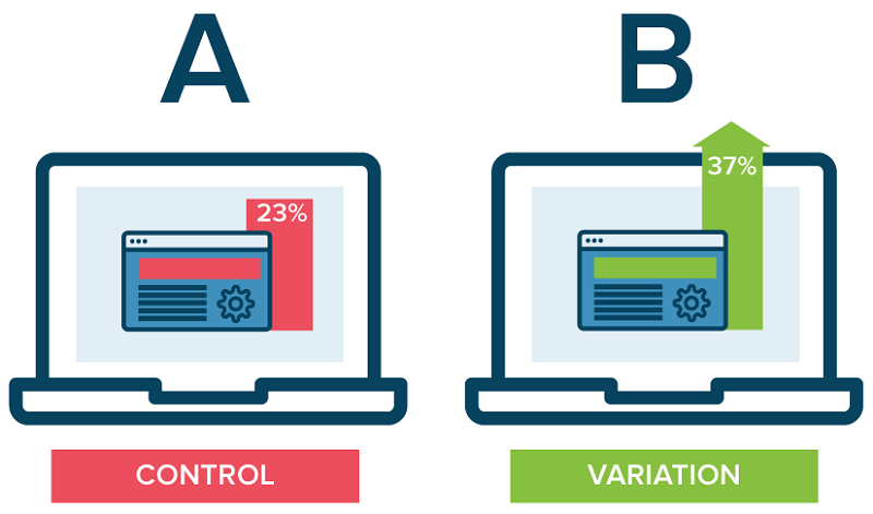
- A/B testing – It’s likely that your messages are not being delivered as you assume they would the first time and GetResponse’s testing tools allow you to track the performance of your pages against various scenarios to help you determine the best layout and delivery for your content.
The success of landing pages depend greatly on your ability to not just serve up a great product but using tools to better understand your audience, ensuring that value is perceived the right way.
Pleasing Your Audience on Mobile is Half the Battle
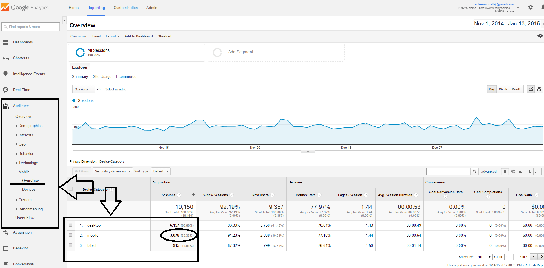
Interestingly, mobile devices account for 66% of all email opens in the 1st quarter of this year.
This means that users prefer the mobile experience and as devices offer more native experiences, their use will ultimately overtake that of desktops.
You’re now in an age where you should assume that every customer accessing your landing page may be doing so from a mobile device.
In addition, considering the high mobile email open rate, if your promotions are done via email then this speaks volumes as to why you need mobile-friendly squeeze pages.
Ignoring the fact mobile device use is so prevalent will lead to high bounce rates on your landing pages since they will not render clearly and provide a great viewing experience for users.
Therefore, they’ll abandon and ignore your message and you won’t convert anything.
Invest Time in Great Copy
A fundamental element of conversion centered squeeze page design is message match, which is the ability of your page to accurately reflect the messaging presented on the upstream ad or other promo content.
For example, the offer you presented in that email which leads to your landing page should be closely related to each other and provide similar value.
The majority of visitors you acquire will be impatient and will not spend time trying to decipher the reasons why your content doesn’t match its purpose; they’ll abandon your site in a matter of seconds.
Here’s an example comparison of good and bad message match on a landing page for a PPC campaign:
An example of bad message match
Ad: Get 70% off the Super Widget 500
Bad Landing page message: Welcome to Sally’s Super Widget Store
An example of good message match
Ad: Get 70% off the Super Widget 500
Good Landing page message: Get 70% off a Super Widget 500 here at Sally’s Super Widget Store
By ensuring a strong message match, you are delivering the value you promised the customer in a clear and easily understood manner; making it easy for them to click and make the final purchase.
Excellent, value-driven experiences coupled with tools to deliver relevant, credible content to your audience are part of a solid foundation for launching landing pages that convert; tweaking and testing your approach until you hit a goldmine.











Hi Erik,
Get that copy down.
Ad copy makes or breaks your landing page. Look at your good match. Numbers, and eye catching ones at that, combined with a serious promise. People will notice this promise and will continue reading.
The bad example is good too; or good to note, for it shows why most fail to convert. Some welcome, others go into converting mode. Welcome people to your blog, but when it’s squeeze or landing page time, make a strong call to action or promise to reel people in.
Think like a buyer, not a seller. Think like a buyer would think. Sellers may want to make things warm and cozy, buyers want to be promised something, and need to be told explicitly what to do next through a clear and definite call to action.
Get clear. Go ahead on numbers-based promises/benefits, and you’ll make conversions as your copy game improves. Just test, tweak and you’ll get there.
Tweeting through Triberr.
Thanks Erik.
Ryan
Conversion optimization is ongoing process. A lot of A/B and multivariate testing is necessary to get to the maximum conversion. There are good practices and ways conversion to be inproved. After all though, it very much depends on the product.
Actually for me conversion depends on various factors which includes the type of product we sell and the way of our approach etc., you post is a worthy one and you tried to explain it enough
Thanks Erik have a good day!!!!!!!!
Nice post
Traffic is very important for any website. That is the reason we optimize our website and share the info on different channels so that people will get to know more about it. But what is the use if people viewing your sharing content and not visiting your website landing page.
So optimization technique should be inn such a way that the visitors should straight away should come to the landing page. The above post explains some points on conversion to landing page techniques. I think the points mentioned above are very useful and god. I guess using always a call of action is very important when marketing or promoting the product or services.
Thank you for sharing.
Hi Erik
I observed in your every post there is a new point which not earlier mentioned with as much clarity and detail as you do.
In this post you fully covered the mobile responsiveness of a landing page and fully supported your narration with the biggest fact of rising number of traffic through Iphones and little gadgets at your blog.
It is very right what is the use of very SEO friendly, mobile responsive and speed facilitating landing page template if you don’t create an impressive copy to convert your visitor.
That is why it is rightly said blogging is the best combination of both digital and manual efforts.
Thanks a lot for sharing this quite useful post.
Erik i dont know much about landing pages so i consider necessarily to employ the services of someone who is good at that. Thanks for these tips, i have learned somethings nevertheless.