The new Timeline layout for pages in Facebook is an important resource for page managers who work with different Facebook apps. It gives them a wonderful opportunity to highlight the application tab for enhanced level visibility and boost click though rates. With the Timeline page, the brands have the opportunity to use different images to promote better offerings and thus create visual interest. The below are some of the best ways to enhance your Facebook Timeline Page with images.

Table of Contents
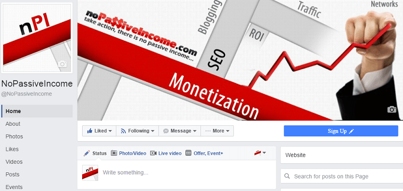
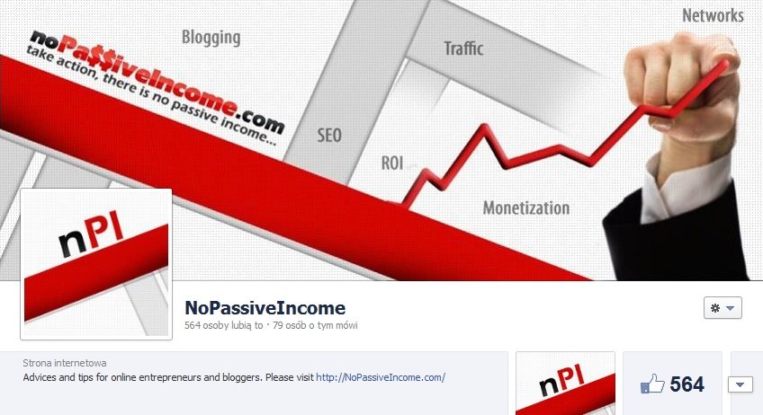
The cover photo
It is considered as the biggest branding opportunity for businesses under the Facebook Timeline Page. Here you get an opportunity to upload a single image of 851 by 315 pixel area. So while creating this cover photo image, Facebook has a couple of do’s and don’t’s as given below:
Do’s
- Make sure you use unique kind of image which portrays your page. This photo could be any popular image of your product. You need to be innovative and play with images so that your target audience simply responds in a better way.
- You need to use cover photo to portray a robust visual impact over your page by simply supporting it with a product image, lifestyle imagery, or via any description of your products/services.
Don’ts
- You are not supposed to carry out ads, promotions or coupons over here.
- It should not carry any price information like download from the site or 50 percent off etc.
- No contact details like the web address, email, and phone numbers should be incorporated in it.
- Any call of action messages like Tell your friend, Grab it now, is simply not allowed in this space.
The profile picture
According to the Facebook, the profile picture is actually a 125 pixel square image area which is present in the cover page area located at the lower left corner area. The profile picture has three different roles to play. It is vital to consider all these three situations while creating the profile picture graphic. It should be done in such a way that the cover photo should blend properly with the cover picture. A few of the best examples include the profile pictures from brands like Ben & Jerry, Macy and Old Spice.
Putting a smart kind of integration over your cover photo and profile picture could be a challenge thing for you. For better understanding, you should check the above enlisted examples and dig deep inside these images. There are certain rules to follow while working with your profile pictures. These include uploading the required pixel based images along with putting the picture graphic as square.
Custom Tab images
This is among the major enhancements of Timeline page, wherein you can see Facebook moving away your navigation and the custom tabs over the top and just below the cover picture. Earlier, the navigation seen was very small which came with a 15 by 16 pixel based icon having a tab name at the left column. Now you can see four different tabs notably portraying at 111 by 74 pixels along with the tab name given below the image.
There are few important guidelines which have to be kept in mind while working with the custom tab images as discussed below:
- Reposition of the photos tab (which showcases the recent picture) is not allowed.
- Displaying a maximum of four tabs is allowed which include the photo tab, while the remaining ones are displayed the moment any user clicks over the arrow icon given at the right of tag images.
- Creating your own graphics for the custom tab images are allowed except the videos, photos, events, notes, and links belong to Facebook.
After following these guidelines, you can customize your custom tab images by the options given over different tabs shown over the Timeline page.
Highlighting different posts for visual impact
You can use Timeline for portraying user and page posts cluttered, counterintuitive, and confusing. Earlier, the users were able to see all the posts in chronological sequence, however, in the new Timeline format you could find the sequence in a broken shape and generally very difficult to follow. But the new page has several highlight features which can get rid of this chaos. You can highlight your page status by simply clicking over the star icon which is seen at the top area at the right side. When you highlight any of your page status, it simply comprises of two different columns in your Timeline. This helps in getting away from the monotony of the two columns along with pulling the attention of people towards that specific status. Highlighting is the best way to fight with the visual chaos of the layout of the new Timeline.
Creating milestone
The other way to get rid of the two column layout and to embark with a compelling outcome is to try the feature of milestone. You can create milestones for your brands by incorporating text and pictures for a number of important events and their related details. The classic examples are the pages from Ford, Macy and the New York Times. These brands have smartly used the milestone features in both the one and two column formats. In order to create a milestone over your Timeline Page, you can simply click over the Milestone option and start doing the needful.
Wrapping up
All the bigger brands and popular companies are seen using these ways to improve their Facebook Timeline Page with different images. Now, it’s your turn to try them out at your Facebook page and feel the difference.


Custom tabs is more important to drive more traffic from FB fanpage.
And it`s very easy to make custom tabs using Google sites.
Hi Margaret,
thanks for your great post. Facebook is the biggest social network and is used by more and more people. And as you wrote – photos and images are great to build our brand on FB page 😉
Chris
Thanks Chris & Khaja, as I mentioned in my post, biggest challenge for page managers is optimizing the page for visual branding. I feel facebook comes with new overhaul each time with its new features or tweaks and hence increasing the opportunities for brands all the more.
Good ideas – How often do most brands change their FB covers? I’ve noticed some changing a bit lately. Thanks.
Hi Margaret,
This facebook timeline cover is just amazing. I like the pics that people upload in their timeline. Creative and unique idea I must say. I like the tips that you have shared with us in adding up the cover photo in our facebook timeline. This is definitely interesting!! Thanks for the share!!
Hi Margaret……
Your post is as beautiful as you are (I am assuming you are using your own photo in your gravatar).
I was not using any cover image in my Facebook fan page but now I’ll try to ccreate a unique one for it.
I’ll change my page profile pic as well.
Thanks for sharing your tips about Facebook Timeline Page.
Hi Margaret,
I believe that Timeline for Facebook is actually great as long as you get yourself used to its interface. I’m not really sure though why this layout bothers a lot of people and even voicing out that they have their accounts be reverted back to its old layout. This is progress for the developers of Facebook and if they don’t like it, they can just stop using it and use other social networking sites. For me, timeline is beautiful, especially if you take your time maximizing its potential visual impact.
Thanks, Khaja and Chris to reading this blog post.
Margaret,
Great post with great information. Facebook can be an effective tool in business and using graphics effectively with it is powerful.
Thanks for these tips!
Jerry
Amazing post..
Cover page should be unique and informative,it should specify something related to your products..by seeing your picture itself people must get idea about your business…its a nice share..Thanks!!